The Starland Village: A Case Study
When the team at Foram Group approached us to brand the latest multi-use development in Savannah’s Starland District, we jumped at the opportunity. After all, the Starland District is in our very own backyard (quite literally if we count where Caty lives) and we understood just how impactful a well-thought out addition to the community could be.
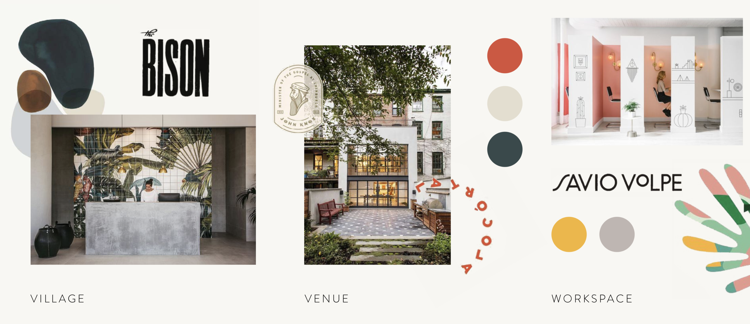
The design brief involved what we call an “umbrella brand” (i.e. The Starland Village), with two other subsequent brands for the multi-family housing and music/event venue also on site. Flourish developed the brand messaging for The Starland Village, then continued to carve out each brand’s aesthetic, tone, and identity so that they could stand on their own while working well with each other.
Digital rendering of the North Building. Photo via TheStarlandVillage.com
“[Flourish] helped breathe life into our ideas, giving them shape and substance and tapping into our ultimate desire to bring forth a community-driven breeding ground for creativity, inspiration, and innovation.”
Before delving into aesthetic, we composed a creative brief that would act as a compass throughout all stages of design.
Quirky-cool takes direction from the neighbors that will inhabit, hustle, and play. Through the tongue-in-cheek use of space and new spin on classic colors, history is reinvigorated to create a breeding ground for creativity and experience.
The phrase “Inhabit. Hustle. Play.” went on to become the official tagline for the entire development.
The Starland Village development involves three entities:
The Starland Village | A multi-family housing complex with adjacent restaurants, shops, and public spaces.
The Neighborhood | A co-working office space for both corporate professionals and creative business owners with business development programming intended for the local community.
The Wesley | A state-of-the-art music and events venue intended to enrich the existing Savannah event scene.
With The Starland Village acting as the primary brand amongst all three, Flourish further developed the messaging, beliefs, and target demographic narrative that would become the starting point for all future communication.
Next, we moved on to visually distinguishing each entity from one another, all while keeping to a similar aesthetic.
Once the brand language - in this case, verbal and visual - was established, we went on to fully develop the identities for The Starland Village, The Neighborhood, and The Wesley.
Because the identity design for The Starland Village would be at times speaking for the entire development, the logo needed to have high legibility. We chose an iconic and tall sans serif font, making slight modifications to the “A” that nods to the local architecture. A simple, five-pointed star accompanies the type-based branding to pay homage to Starland Dairy, once an anchor of the Starland District.
Branding for The Neighborhood was inspired by the variety of businesses intended to occupy the multi-level co-working space. How do you develop a brand that speaks to both law firms and creative agencies like ourselves? How does the brand both inspire and add legitimacy to a business’ image? It’s with these questions in mind that pushed us to design the following:
A playful, outlined font with an office-esque “strike-through” became the foundations of the brand identity. We chose a vibrant yellow as the accent color, while making sure the branding stood on its own when presented in black and white. The monogram mark resembles a compass, playing off of the “N” for North. We felt that occupying a creative space such as this would give direction to any business, promoting growth and forward movement.
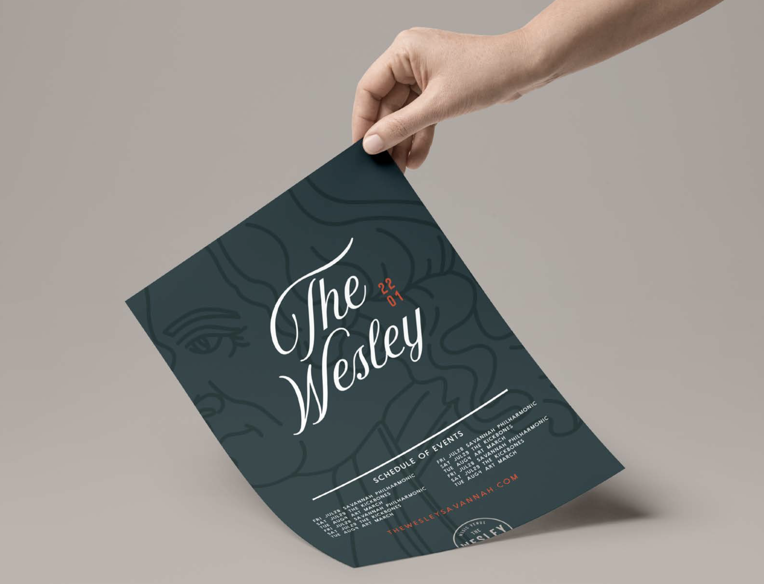
The events and music venue carries perhaps the most history of all the entities as the location rests within a renovated 19th century church. Primarily used by those of Methodist faith - and most notably by John Wesley, considered the father of Methodism - the venue now carries on that history through its name sake.
The identity design had to strike a balance between classic and youthful, as the intended program ranges from TEDx talks to high-production value rock concerts. We modified a handsome script that to us spoke to both of these extremes.


